Year
2014 commercial project / 2024 self-initiated remake
Client
Mazda Colombia via Proximity BBDO (2014 only)
Role
Visual Designer
Design Team
1 Designer and 2 Content Strategists (2014)
Project Duration
1 month
Project Name
Mazda 2038 Remake
Description
In 2014, Mazda Colombia’s website needed a major update. A small multidisciplinary team rethought and rebuilt the experience. This showcase revisits that brief through a contemporary product design lens, retaining the original information architecture and content strategy while applying current standards for responsiveness, hierarchy and digital brand expression.
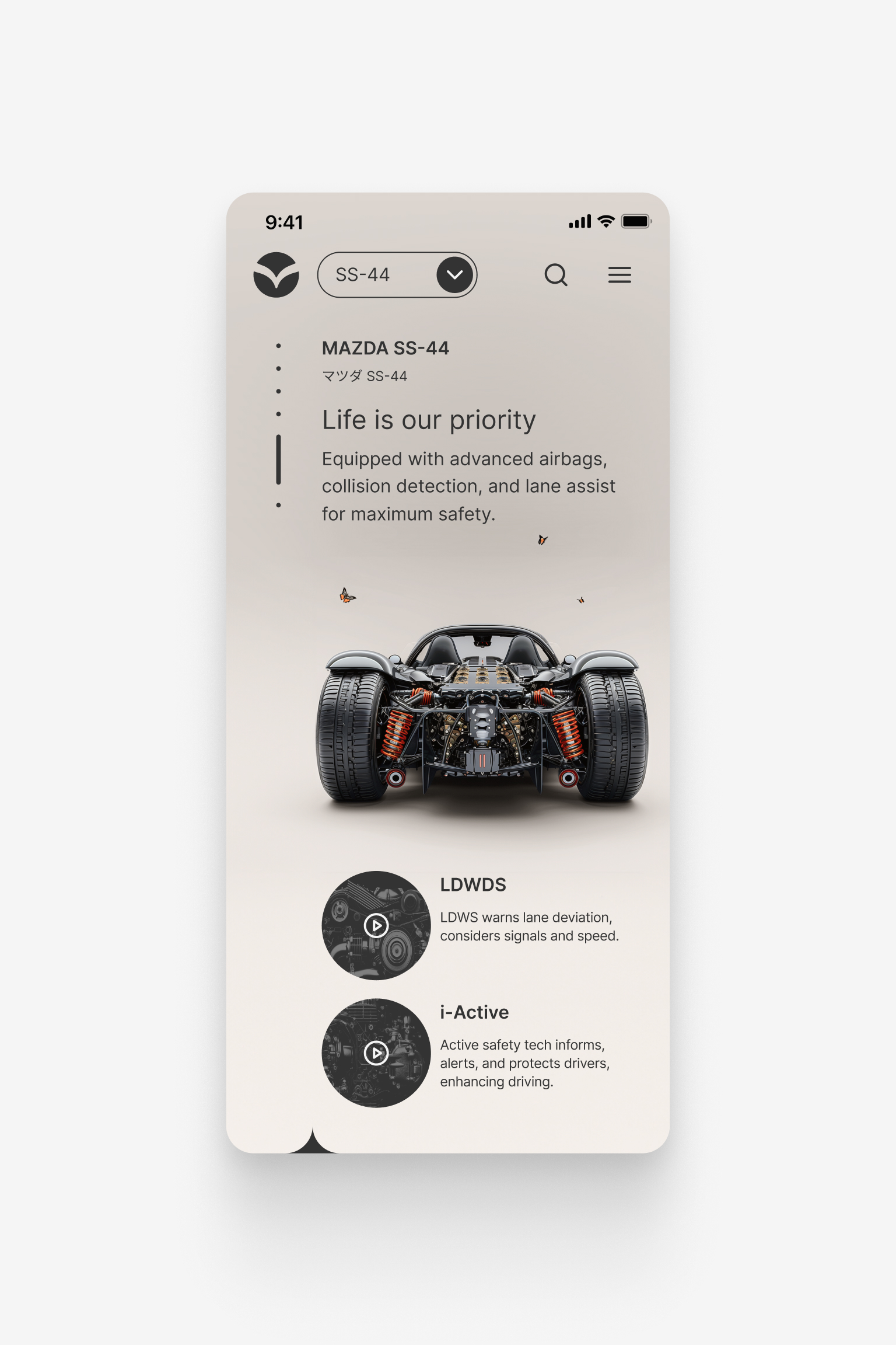
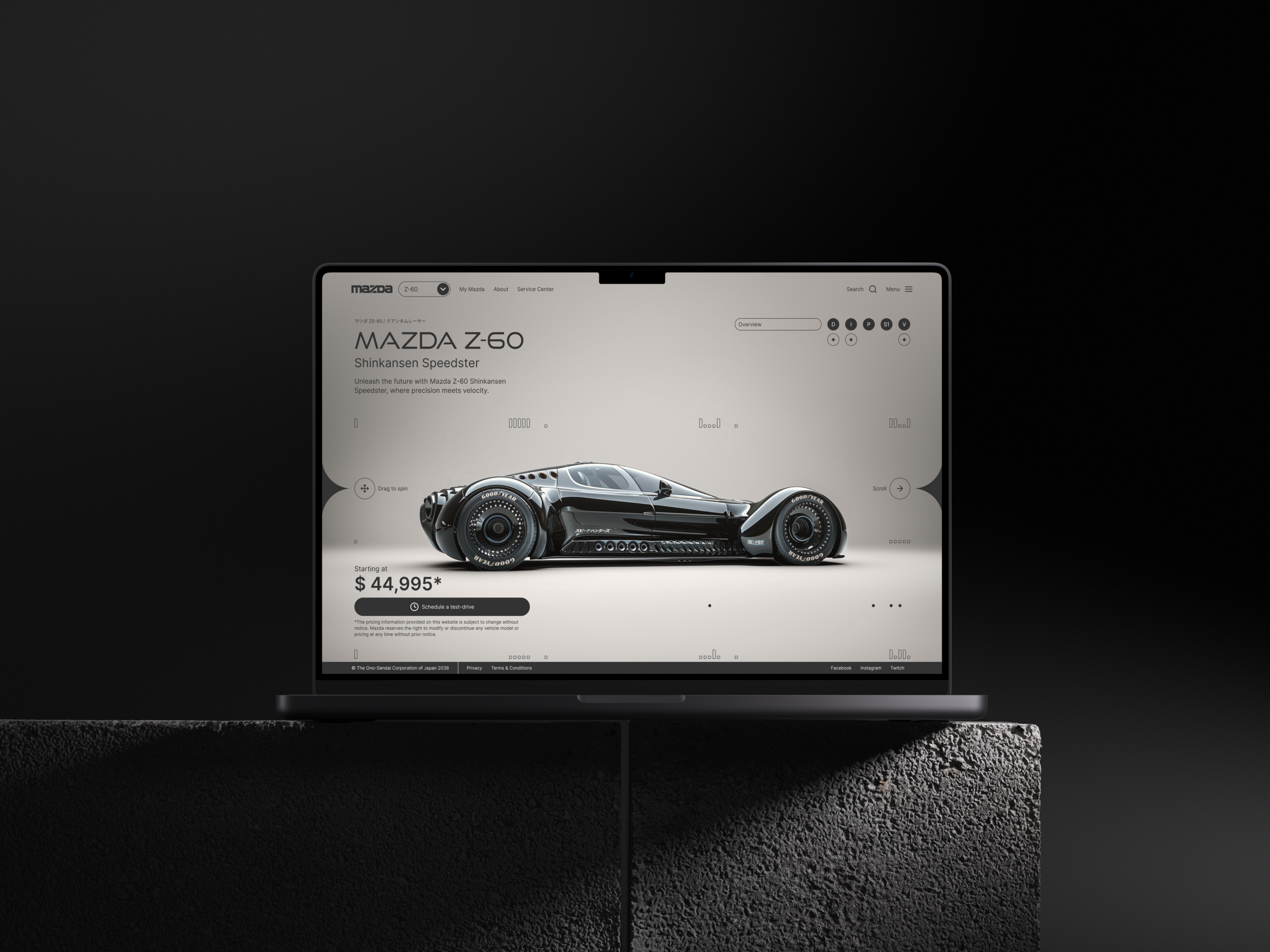
The self-initiated 2024 redesign expressed Mazda’s core values—Japanese innovation, precision and technology—through a focused digital product experience. I proposed a cleaner, minimal art direction that reduced visual noise and made the vehicles the primary interface and storytelling element. To move beyond a conventional automotive website, I replaced the original model imagery with generative AI assets and extended parts of the brand language, exploring how Mazda’s digital presence could evolve into a more future-facing expression.
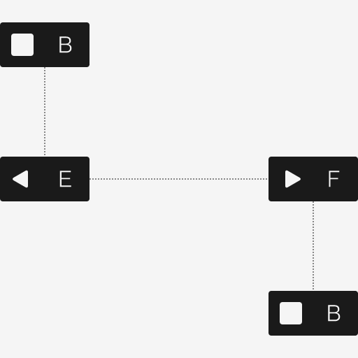
The Design Process
Our design work was based (B)* on the vision developed by Fjord during a Discovery phase. Then, working as an embedded consultancy team on-site with Avianca near the airport (R)*, we used rapid ideation (E)* to develop and test ideas (F)* internally along with the client. Decisions were documented (B)* as the work moved across phases, creating continuity between local and international teams.
By transferring methods throughout the engagement, the consultancy also helped strengthen Avianca’s internal design capability to maintain and extend the experience.
*Based on the ideas from Alejandro Masferrer’s “Design of Creative Processes”.
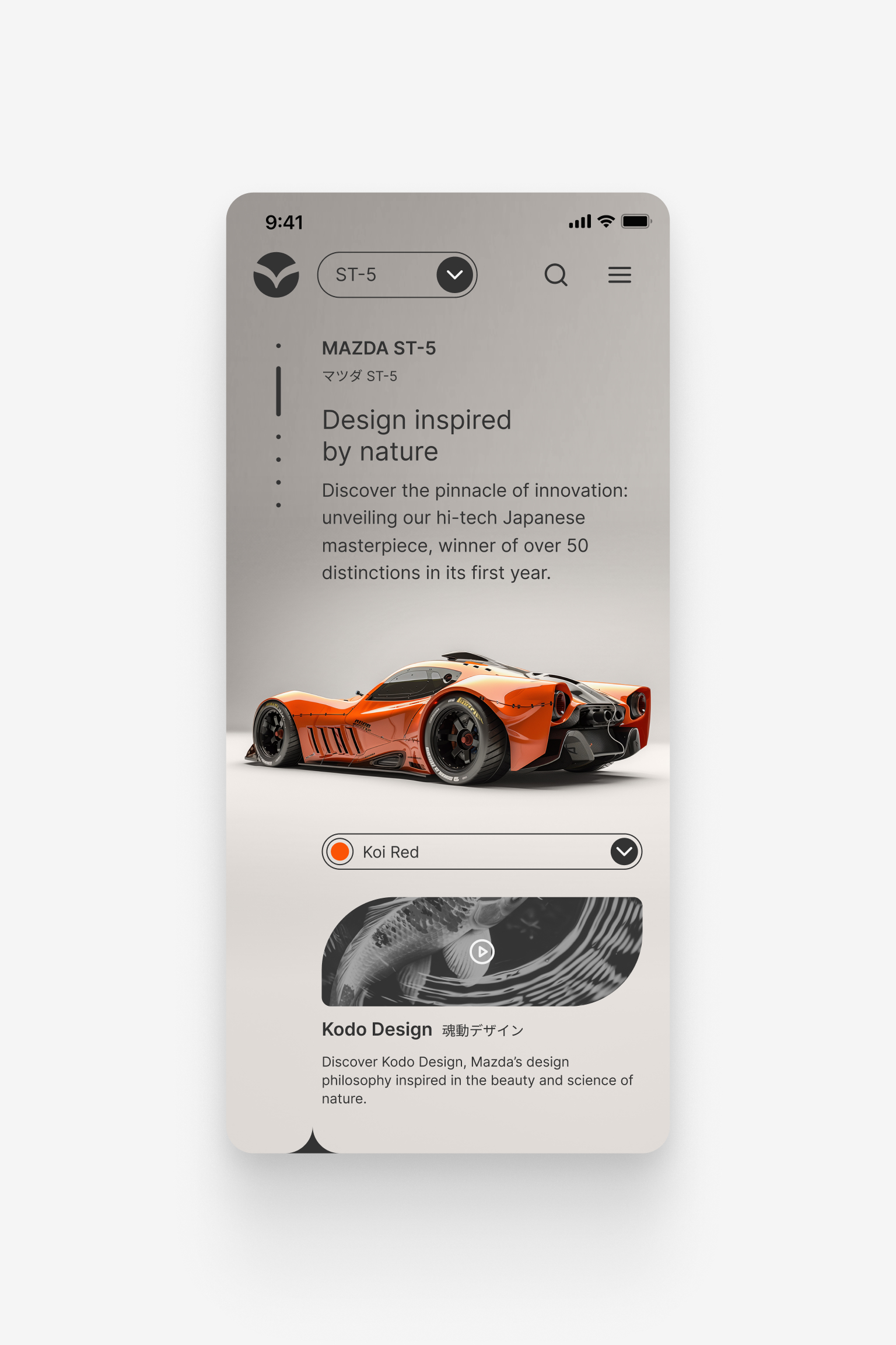
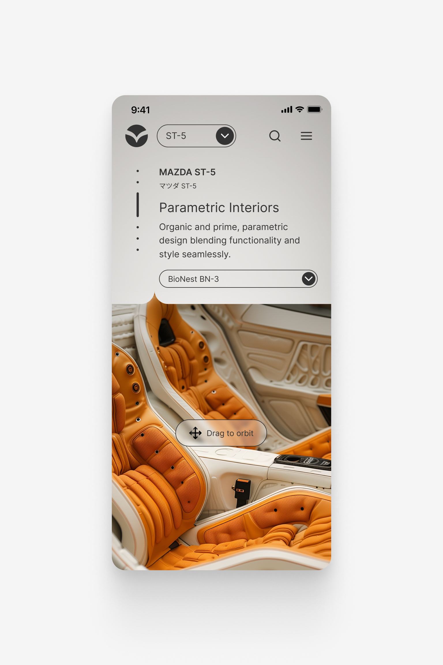
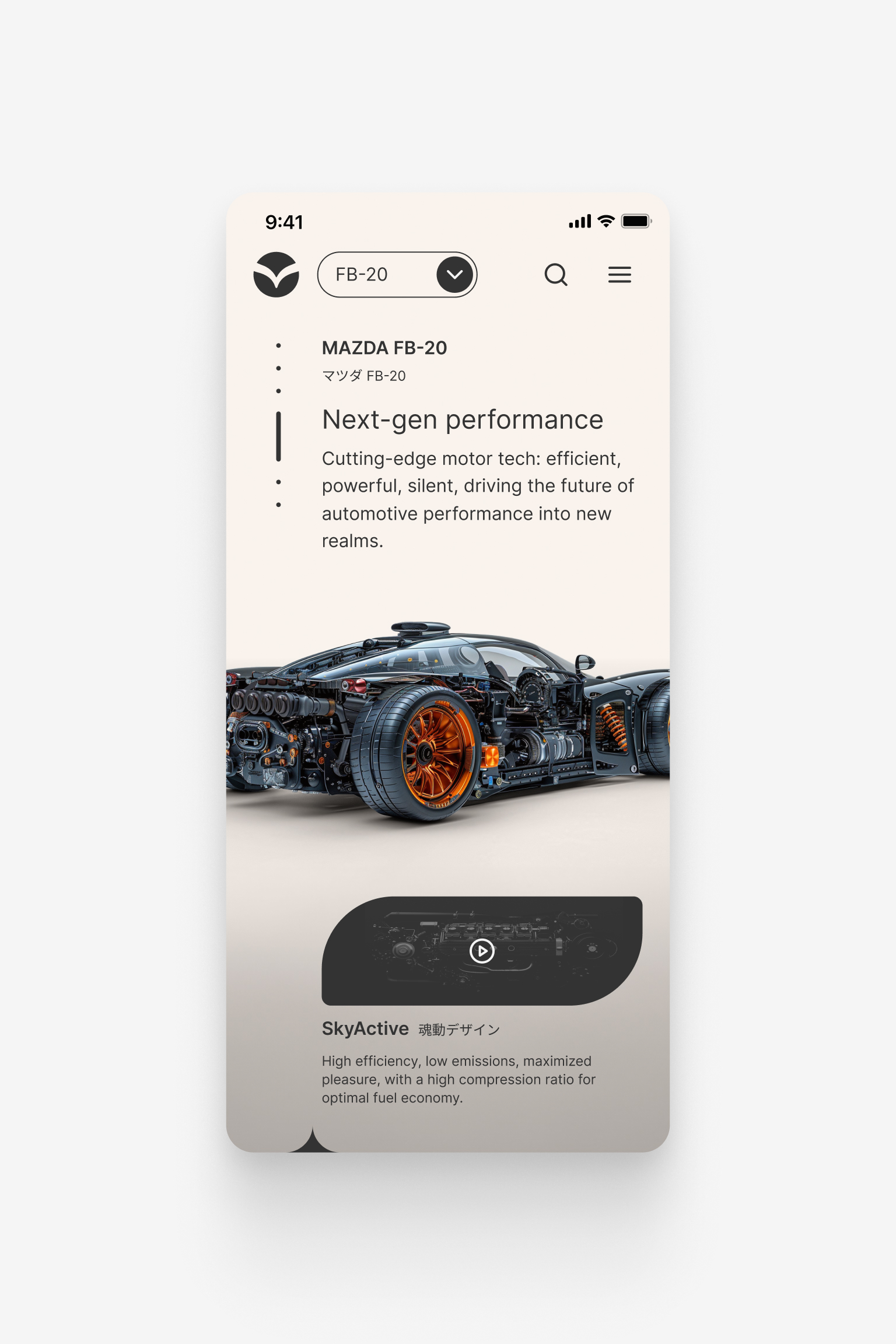
Vehicles as the primary interface
A clean interface allowed the vehicles to become the primary visual and storytelling element. Navigation, hierarchy and content access were designed to express Mazda’s technological character without competing with the product.
This relationship between restrained UI and prominent imagery defined the experience across screen sizes.



Credits and Resources
Resources and Tools
Fonts
Inter, Google Fonts. https://fonts.google.com/specimen/Inter
Good Times, DaFont. https://www.dafont.com/good-times.font
Tools
Figma. https://www.figma.com
Midjourney. https://www.midjourney.com
Photoshop. https://www.adobe.com
Lessons Learned
Information Architecture
Optimize complex information for conversion
In the 2014 commercial project, content strategists defined a funnel from exploration to lead generation and contact. Translating that structure into information architecture and wireframes showed how large content sets could become a clear, conversion-oriented experience within a short production timeline.
Made with Semplice
Contact
If you want to get in touch, just reach out on any of the following:
© 2027 Juan Piñeres